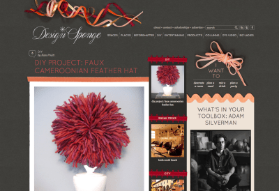
Screenshot of Design*Sponge
At the beginning of this week, Design*Sponge relaunched, sexier and search-ier than ever.
The old Design*Sponge, which launched in 2004, was my top site for looking at pictures of decorating, learning about using tools, and reading about business things, probably because it had all of that in one place.
The relaunched Design*Sponge still has all of that, only now it’s way easier to use. You can sort projects by difficulty, cost, technique, materials, or type of furniture, and the other areas of the site (flowers, entertaining, etc) are also sorted into super useful categories (organization: I am a fan). Sometimes it’s fun to dig around for whatever it is you’re looking for, but now it’s a lot easier to actually find things. The new, darker layout looks a little cleaner than the earlier linen- and ribbons-based design, which founder Grace Bonney says was the point:
“I wanted the site to feel like the “older sister” of the current site: something more sophisticated, cleaner and reflective of the change all of us here at D*S have gone through over the past four years. I started this site when I was 23 and now I’m about to turn 30, so I wanted the look and feel to be a better representation of what I love at this age and place in life. In addition, the content had so outgrown the navigation system that it was nearly impossible to find old posts that you were looking for. So we decided to not only overhaul the look, but the way the site works from the bottom up.”
The redesign has received a few negative reviews, especially from users who don’t seem to have AdBlock enabled and who aren’t happy with the wider sidebars and darker background. Also, users have a history of not really liking change (see also: any time anything changes ever on Jezebel or Gawker or, for that matter, Facebook or Twitter). And that can be valid. But in this case: I love all of it.


Yeah, it’s too dark. Especially when paired with a too thin light pink font for titles. It hurts my eyes :( Usually with dark websites you have to REALLY make it work, or you fail miserably. Unfortunately the designer didn’t quite get that contrast right. I really love the ribbons though!
hmmm. well, it has an elegant concept, but it’s rather busy.
needs to be more spacious… room for the eyes to roam…
(despite the clever and cool content)
I don’t mind the layout. What bothers me is that I didn’t know about this site before! I’ve just spent about 45mins looking through projects…bring on the crafting :D